Airtasker | Homepage Adjustments

Adjustments in Detail

The following document describes the adjustments made on the revised version of the Airtasker homepage.

Beyond the visible changes, the main adjustment lies on redefining the base of the design system, in terms of code, based on principles from:

  • Google's Material Design
  • Airbnb's Visual Language
  • 8 points Grid System and Golden Ratio Principles

With these principles in mind, the idea is to provide beauty to everything Airtasker builds through harmony and proportion in Design.

What is the Golden Ratio? The Golden Ratio is a mathematical ratio commonly found in Nature that, when applied to design, it provides a sense of balance that is aesthetically pleasing to the eye.

App Header

Current Homepage
Revised Version

Adjustments made for large screens

  • Made Airtasker logo Bigger
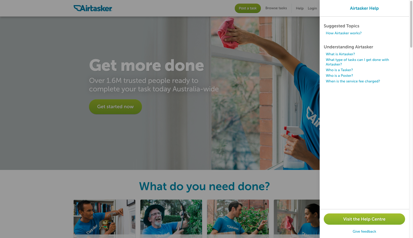
  • Simplified navigation by bringing the 2 navs together. This helps to add some more white space, making it look a bit cleaner and simpler
  • Darkened links grey colour and adjusted font-size to improve contrast and readability
  • Changed border-bottom with a box-shadow to add more depth to the user interface
  • Changed call-to-action button's colour (red) to green to improve UI consistency
  • Moved "How Airtasker works" into "Help" and added a sidebar showing related content (Similar as Airbnb does). Image attached below:

Adjustments made for small screens

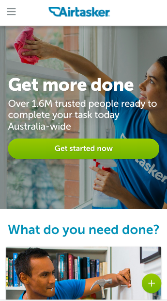
  • Changed call-to-action button's position to bottom-right corner of screen (thumb's comfortable zone) to make it easier and quicker to reach. Image attached below:

Hero

Current Homepage
Revised Version

Adjustments made for large screens

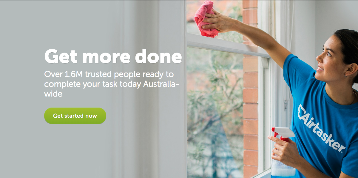
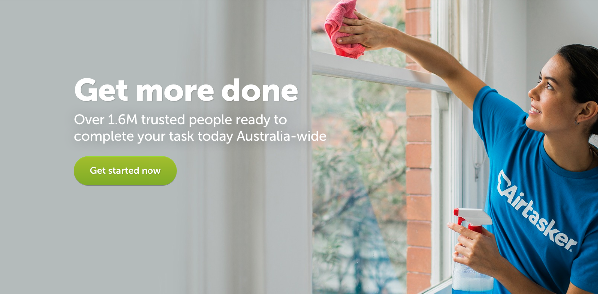
  • Made slight typographic adjustment to copy's line-height
  • Adjusted the font-weight and fixed typographic orphan in "Australia-wide" making the block a bit more compact

Adjustments made for small screens

  • Adjusted font-sizes and height of Hero on smaller screens

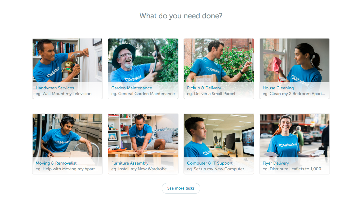
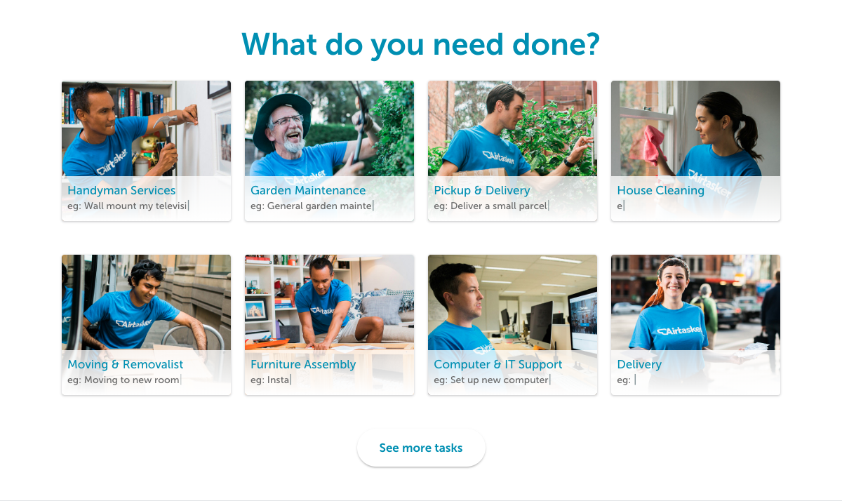
What do you need done?

Current Homepage
Revised Version

Adjustments made for different screens

  • Adjusted padding and spacing between elements (applying the 8pt Grid System principles)
  • Applied consistent font-size and font-weight based on defined Design System to heading. Also made it blue to help it stand out more and consolidate branding
  • Darkened grey text and adjusted font-weights in tiles to improve readability and contrast better their levels of information
  • Included more tasks examples
  • Improved "See More Tasks" button style, adjusting its size and style

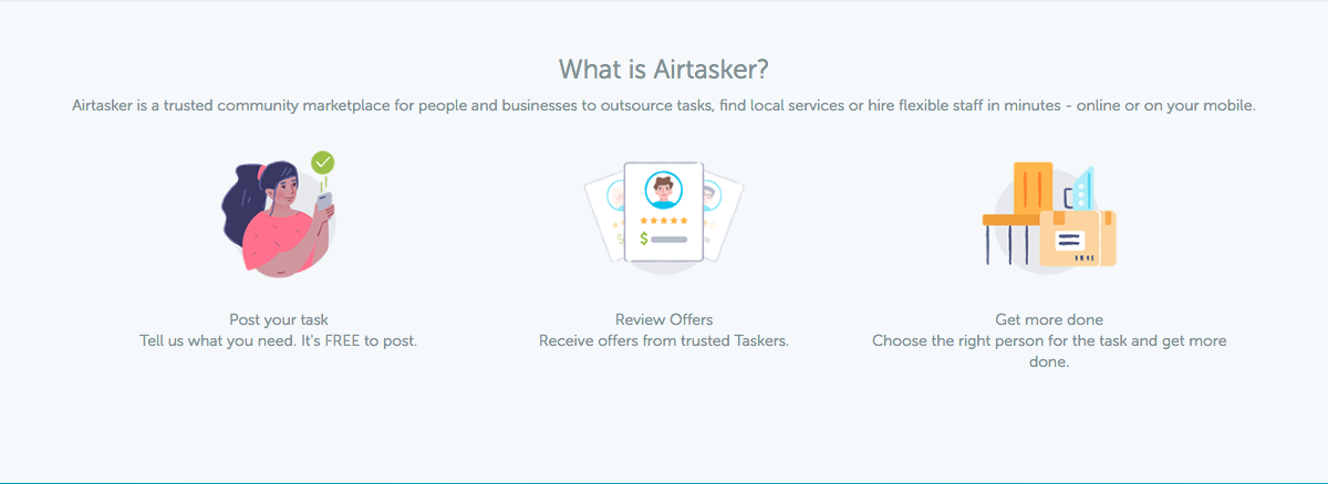
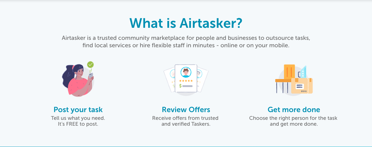
What is Airtasker?

Current Homepage
Revised Version

Adjustments made for different screens

  • Improved readability with previously defined consistent font-sizes and font-weights to the different levels of information
  • Applied consistent box-shadow
  • Darkened grey text for better contrast and readibility
  • Applied consistent spacing
  • Broke lead text into 2 lines and adjusted its font-size for better readibility

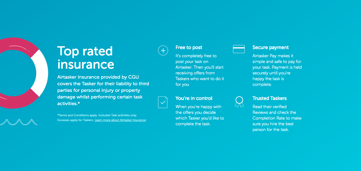
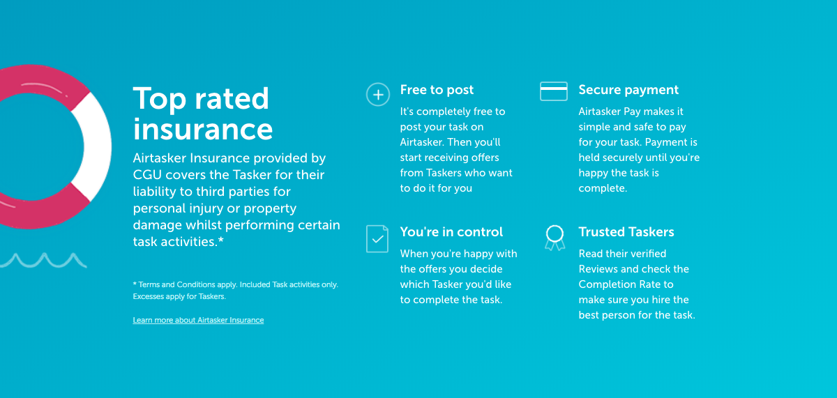
Top Rated Insurance

Current Homepage
Revised Version

Adjustments made for different screens

  • Applied previously adjusted font-sizes and font-weights for consistent UI

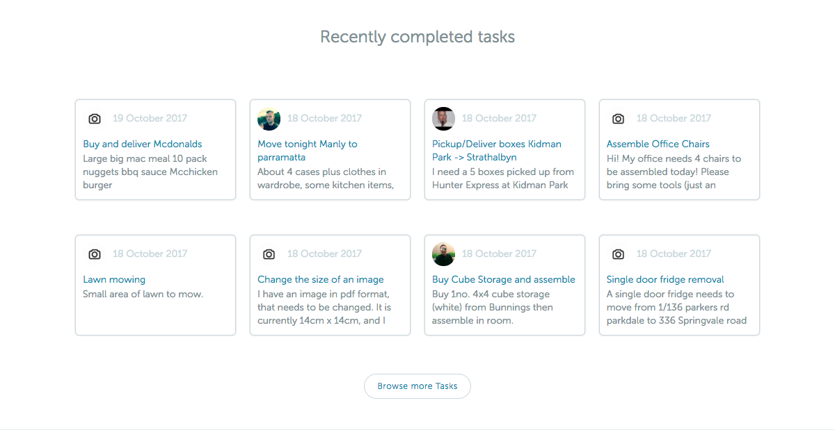
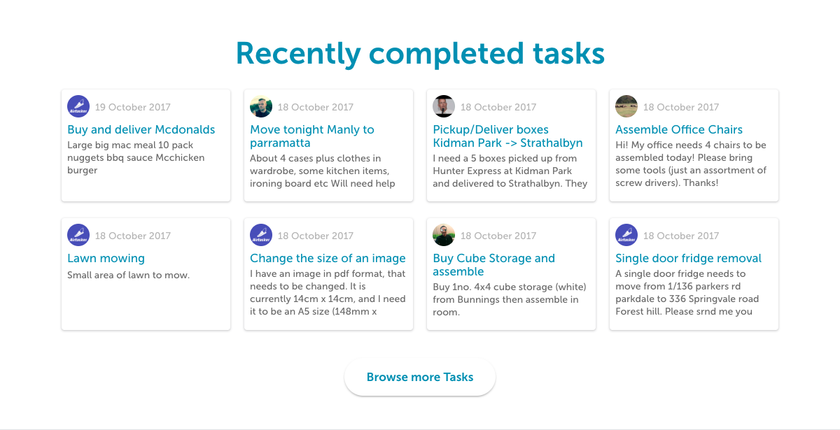
Recently Completed Tasks

Current Homepage
Revised Version

Adjustments made for different screens

  • Applied previously adjusted spacing and UI styles (font-sizes, font-weights and line-heights) for better readibility and consistent look&feel to tiles
  • Soften tiles border with consistent box-shadow style
  • Applied consistent button style to "Browse More Tasks"

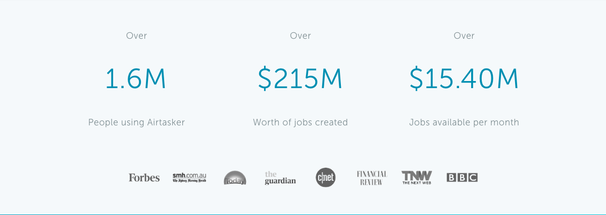
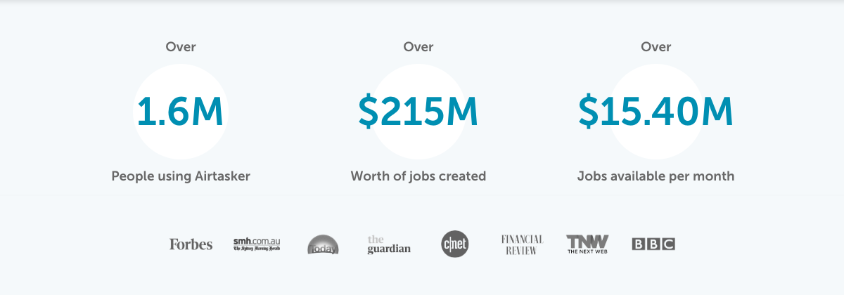
Stats & Numbers

Current Homepage
Revised Version

Adjustments made for different screens

  • Applied different font-weights and adjusted spacing between lines to improve hierarchy of information
  • Styled Numbers to highlight them more

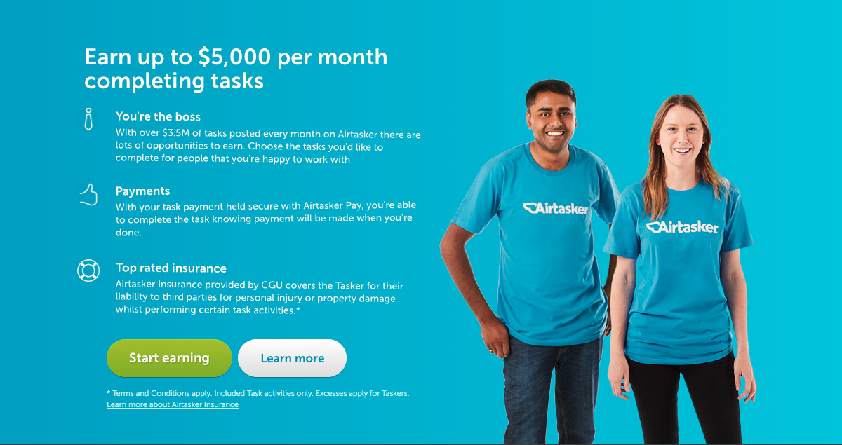
Earn up to $5,000 per month completing tasks

Current Homepage
Revised Version

Adjustments made for different screens

  • Applied previously defined spacing, font-sizes and font-weights for UI consistency
  • Made buttons look consistent in size and style (currently both skeuomorphic and flat styles)

General Adjustments:

  1. Reset Base Font Settings to improve font legibility and text readibility across the site by:
    1. Defining base (normal) font-weight as 500. As the CSS font-smoothing property tends to smooth the curves of glyphs making them look sharper but thinner, by defining the Medium font value as the Regular, we can achieve a sharp Regular font-weight. (More information about font-smoothing here: http://szafranek.net/blog/2009/02/22/font-smoothing-explained/)
    2. Increasing the base font-size
    3. Improved text contrast by darkening the grey body colour #839094 was changed to #686868
  2. Introduced 8px grid system and Golden Ratio Design Principles
  3. Gave more presence to the brand's main colour (blue)
  4. Improved hierarchy of information by setting font-sizes, font-weights and more contrasting colours to different text levels.
  5. Simplified top navigation (following Airbnb's tested UI)
  6. Revised current line-heights (setted to half pixels units)

Recommended Articles: